 As many readers know, I'm currently having a sale in my shop so I can clear out most of my stock before we move to New Mexico at the end of June.
I haven't been making much lately, instead taking the time to read, blog, and reflect on my business on a whole. While I'm feeling the itch to create, I'm starting to look at the sale and move as an opportunity rather than a delay--- as someone who has crafting ADD, it will be exciting to redesign Paper Menagerie with a cohesive look and feel that truly represents my ideas--- and add new products to the line.
This is where you come in!
1. Please take a look through my shop and leave a comment below. What designs or aesthetic would you like to see remain? Are there any cards or colors you identify my line with? Are there any new products you'd like to see when I relaunch in September? I would really love to hear your thoughts!
2. Commenting will be open until Friday, May 30th. On the 30th, names will be drawn using the Random Number Generator.
3. The Grand Prize Winner will receive three items of their choosing from my shop, the second place winner two, and the third place winner one. (If the winners do not respond to messages within three days, I will select another winner.) Best of luck!


23 comments:
well, you will *have* to keep Jane Austen. I'm sure you already know that. Have you considered doing a card with just the silhouette, like the moleskin? I'd like that.
Colours I identify your line with -- teal and yellow, for sure. If you're keeping your blog teal, you ought to keep it in your shop! Plus, it's such a darn pleasing colour -- and easy to write on for cards. And it goes with everything. Ditto the soft yellow.
New products -- what about stickers of your prints? Even just a crop of a print could be cool. Just a thought.
Hope the sale is going well!
I agree....the Jane Austen inspired cards and the moleskin is so lovely, you should keep those. The other thing I like about your "look" is that you seem to use colours that make the card look aged, I LOVE that. The bunny ones printed in brown..lovely.
Best of luck with your sale!
I'm also a fan of the Jane Austen section. And I really like the horse of a different color design. Letitah made a good point about the colors. I agree with keeping teal in your blog if you're going to keep that color in your shop.
Good luck with your move!
Another vote for Jane. I really enjoy your magnets too- the colors and themes are quite lovely to look at.
Something new that would be nice to see is the cards printed on white/ivory tying in to some of the pretty pinks, turqs, greens and golds that are in the magnets and with a coordinating envelope. Using the same images you have (they're great)...
I really like the Jane themed cards as well-there aren't as many author themed products as I would like on Etsy!! Keep those!
I'm agreeing with both Letitiah and Cicada.
Jane Austen (!) teal, yellow and white for colors
I like Jane...I have to agree with the others.
I like some of your throwback products - the Alice prints and the chipmunk cards. I would vote for more prints on book pages.
Colors? As a buyer I like things that feel seasonal - floral colors in the spring, faded brights in the summer. You get it...
Hey, best wishes on your move. I hope you love it! Carrie
I love the ones that have a vintage style with the scroll edges.
I love the Jane collection.
I like the cards/papers with a solid color background and contrasting image.
I agree with everyone about Jane Austen!
I love your shop so I don't know what I want to stay because it all looks lovely! The stickers are pretty cool.
I've also just ordered The Boss Of You book after reading Loobylu's blog. It should be coming soon.
I love the birds and would love to see more prints on book pages. As for colors... I like an ever-changing palette so I'm no help here.
I really love your style. I think the bird motifs and silhouettes are especially lovely.
I like most of your animal-themed items (especially the magnets), and I think they fit together well and go with your shop's name. I like the plants, too.
I'm going to go against the crowd and say that I don't love the Jane Austen cards. I don't mind them, though.
I LOVE your Jane Austen silhouette. I like the color variety in your shop.
New products? I'm a sucker for anything with silhouettes so maybe include different ones--
I really like the button magnets, flat notes and the moleskin journals. I would like to see more styles for the flat notes and journals...and maybe even include more quotable cards as well to add to the Jane Austen.
Good luck with everything!
I just love all the items in your shop, I'd hate to see any of them go! I'd like to see more of the animal prints - perhaps some different animals in addition to what you currently have?
I love the birds and dogs, love the Jane Austen line, love love love the buttons! Your shop is already very cohesive and very professional!
I hope your move goes well!
Personally, I would be delighted if you kept the Jane Austen moleskines!
There are two kinds of styles/colours that I identify your line with. The Jane Austen products have a classic, elegant appeal and a number of other items have a natural, vintage appeal and choice of colours.
As for new products, I would be happy to see more cards with quotes from various works & writers. Also, you could make cards matching the design of the Jane Austen moleskines, e.g. a black card with the silhouette in silver ink or a simple white card with the silhouette in black ink! :)
Hi Angela. I love all the images you use. They are so unique & keep with your themes of literature/library/vintage/nature. I think your shop certainly has a cohesive theme.
When I first started someone gave me a tip of taking pictures of all my products in a similar fashion (all on a white background, wood background, etc.). So even though you offer various products like cards, moleskins, buttons, & stickers, they look like they go together because they are photographed the same way. I am no stylist so I just opt for the white background and the occasional wood.
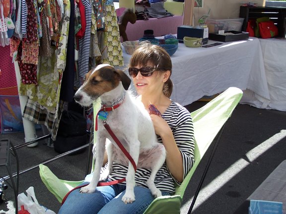
I think people really identify you with the JA, the turquoise and pink inks and paper you use, and your jack russell :)
Good luck with your move and I look forward to seeing your new shop! I will miss seeing you at fairs around here this summer/fall!
I haven't read everyone's comments thoroughly, but scanning through them I noticed that lots of people said the same as what I'm saying - definitely keep the Jane Austen Silhouettes.
Going a bit against the majority also...not a big fan of the Jane personally, however I think it is probably a strong part of your already created brand.
Love the fine sketches on colour cards - muted colours look great and aged. I think your shop currently has quite a vintage feel (cleverly mixed with splashes of contemporary colour)....it's very worldy like.
The prints on book pages are fantastic!
Best of luck with your re-launch in Sept.
Jane must stay, that's for sure, but the reporpused stickers are also gorgeous stuff and I like the birds-buttons! I can only advice: go on like you were doing, you have a gorgeous shop!
Ohh the doggie notecard muct be kept because I've got a terrier and he is a monsterdog but a lovely one. Your butterfly stickers are grand and I'd like to see more bookish type items....I love words...so maybe quotes with some of your designs.
Good luck with your sale and move.
Post a Comment